Things have been a bit depressing lately, and i have witnessed that as a result of this, we are seeing lots more colour. In times of economic uncertainty, people often need to cling onto hope and one of the easiest ways to express this is through colour. Even in the very recent fashion week shows which took on a very different format during covid-19, we saw splashes of colour symbolising a new optimism.
Click HERE to see our Sensory Pinterest board
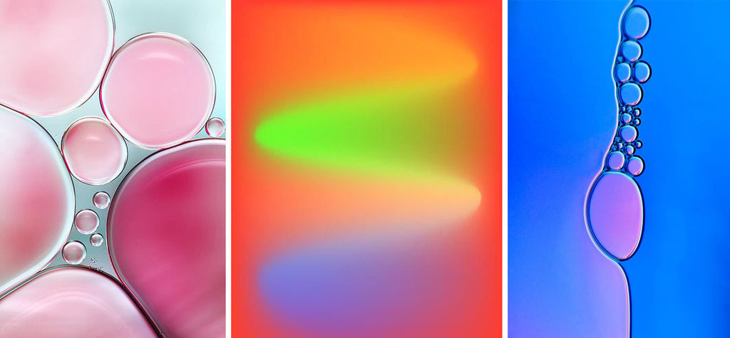
Colour psychology and emotions
Colour is closely linked with psychology as we all know. Ideas such as red symbolising danger and hunger and blue being a colour associated with calmness, security and trust, thus way companies such as facebook and twitter use this colour in their branding. As designers we often select colours subconsciously based on our own emotions and the messages that we want to communicate.
Having my own business, i have found that offering many colour options, whilst is great and fun, it can also be problematic as customers sometimes cannot decide which colour to go for and end up paralysed by choice. It is also more expensive to offer more colours to the customer - more stock, minimum order quantities and some colours that are less popular than others are all a cost that needs to be absorbed.
However, in these times, i feel that product formats are being simplified and colour is taking centre stage. We are looking for utilitarian products that appeal to our sense of security and basic needs.
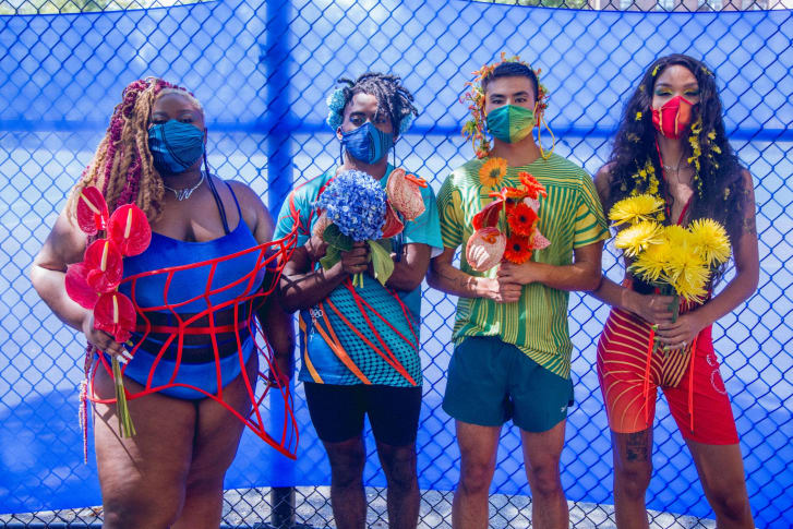
Chromat Spring-Summer 2021
Here are some of my favourite high octane colour brands and instagram accounts that bring a smile to my face. They are brave, bold and unapologetic with colour.
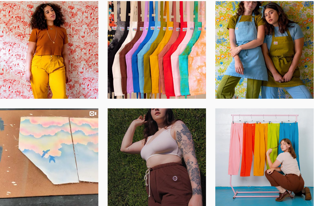
LA based clothing brand tackle the issues of plus size and inclusive design really well and colour comes into this as well. They have the hugest colour range of much loved staples including aprons, t-shirts, trousers and fleeces. I would definitely buy lots of these pieces if i was in the USA. Click on the image below to be taken to their instagram page.
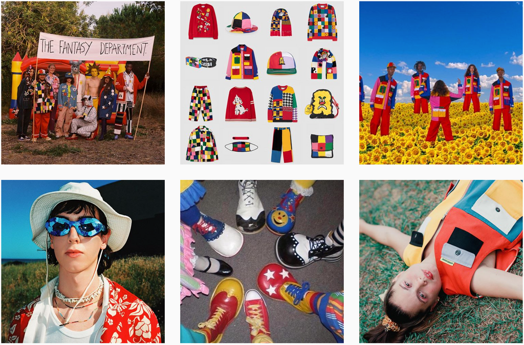
Outsider Division is a Barcelona based clothing brand. The brand is all about colour and individuality and through fashion removing stigma from being an outsider. The designer and founder of the brand is David Méndez Alonso established the brand in 2012 and the brand has grown rapidly in the last 8 years. There are many pieces that i love and they sell out fast.
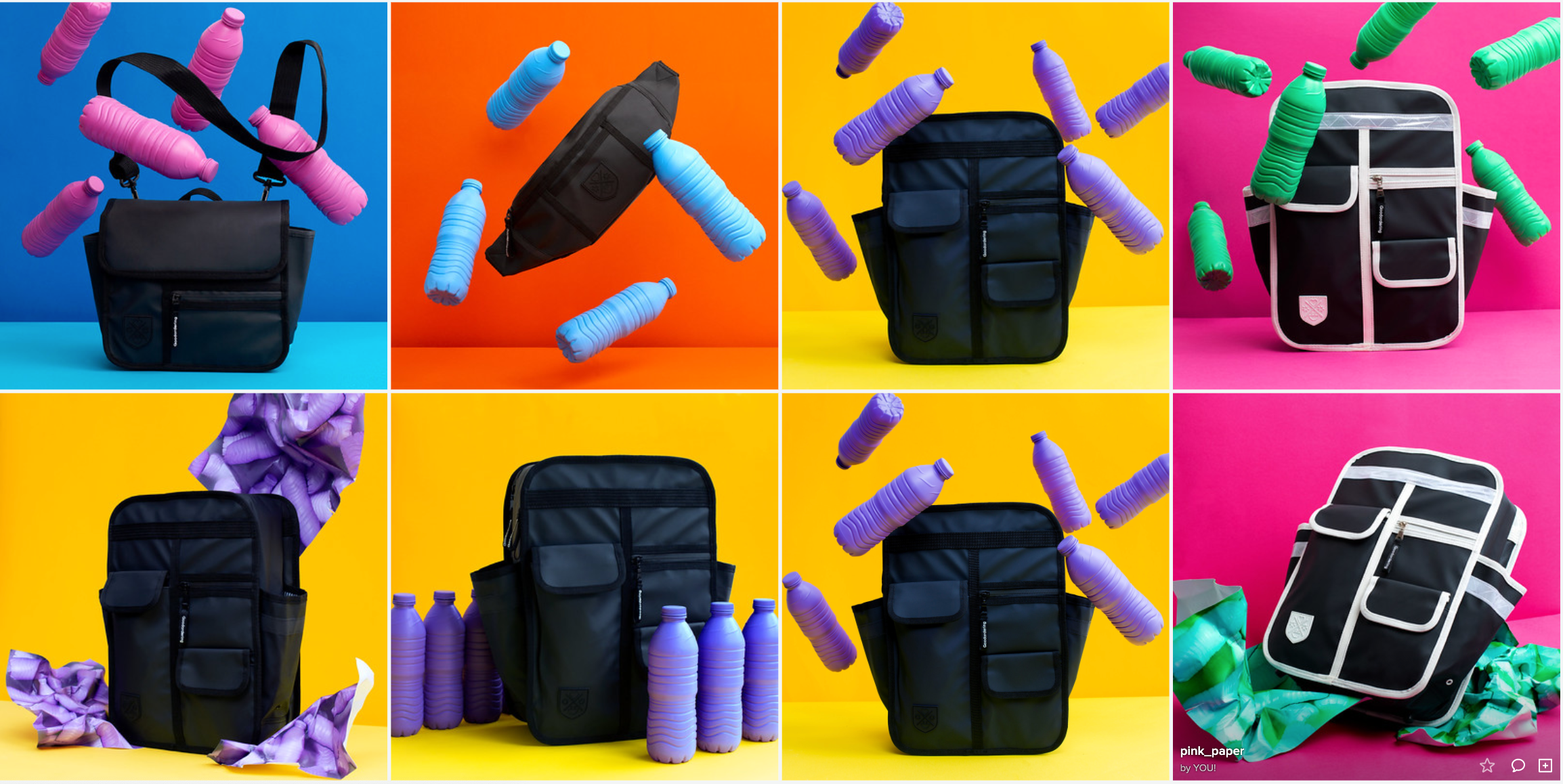
Bringing fun to cycling,
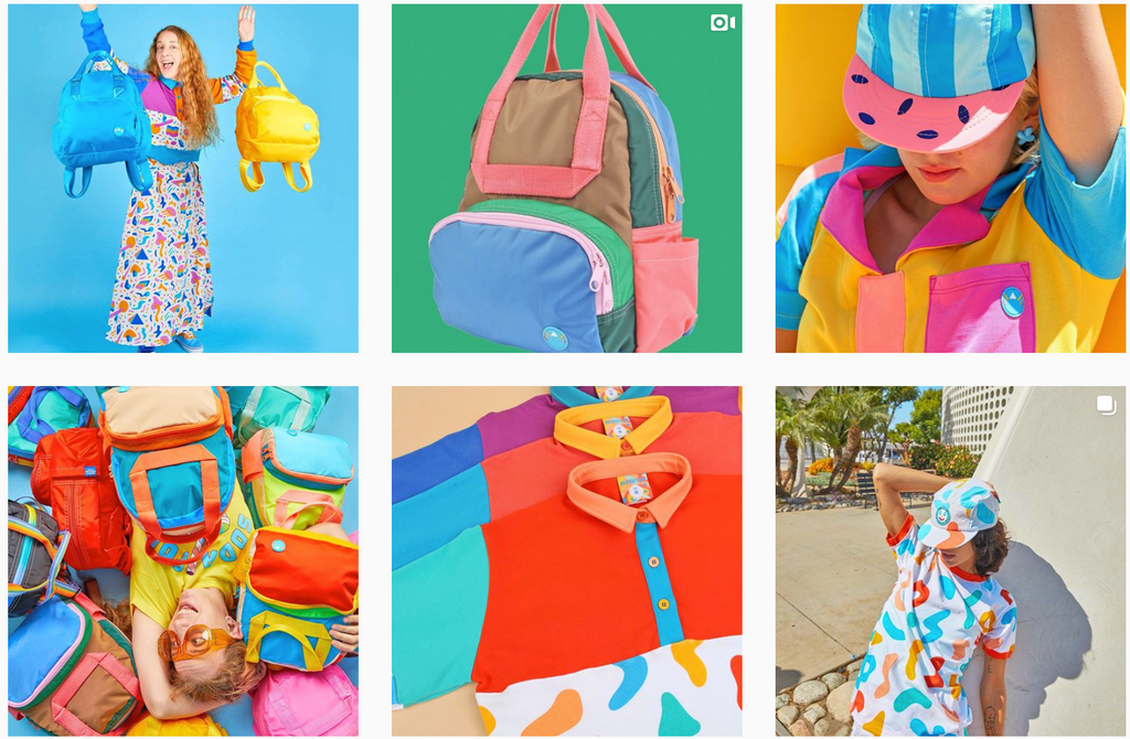
Goodordering is all about classic colours that withstand the test of time and trends. The bright range of bags were originally designed for high visibility when riding a bicycle, but now the brand has become known for its playful approach to design especially in the cycling accessories market which has been predominantly black for a long time. Bicycle pannier bags, convertible pannier bag backpacks and all sorts of other cycling accessories that make you just want to jump on your bike is what Goodordering is all about. I love using colour to influence mood and I hope to spread joy and happiness by designing accessories that ring a smile to your face.
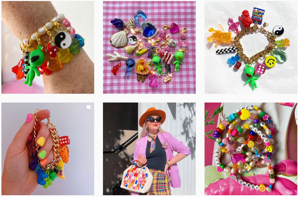
The home of the charm is Blackcurrant pop. Beth the designer / founder talks about the brands as "primary school chic" which i love. The trinkets range of humorous items to classic pearls and the very mixing and matching of these seemingly random items is just so charming. Colour is integral to the nostalgia of these items from our school days. Back then we collected, swapped and swooned over these little charms. The fact that adults are now returning to this style of fashion accessories is testament to the fact that luxury has moved from being monetarily driven to being based on memories, experiences and positive connections with friends and family. There has never been a more important time for families to reflect on what they to each other.
Mokuyobi threads is an LA based apparel and accessories brand that make unapologetically playful and colourful items. What i love about the brand is the unusual pairings of colours and the fact that the brand or the founder / designer
Julie Pinzur doesn't take herself too seriously.
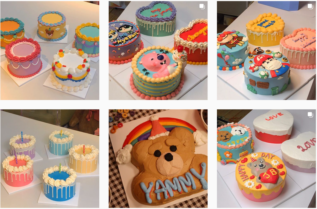
Korean cake company Yammy Cake create the most kitsch beautiful pieces that just defy the entire meaning of ridiculous I want one of these cakes for my birthday more than anything. The combination fo sickly sweet colours and fairytale style frosting just make these cakes addictive to look at. There have been a few Korean cake companies skyrocket in popularity recently. I think its a response to the depressing and uncertain times we are in and our urge for escapism.
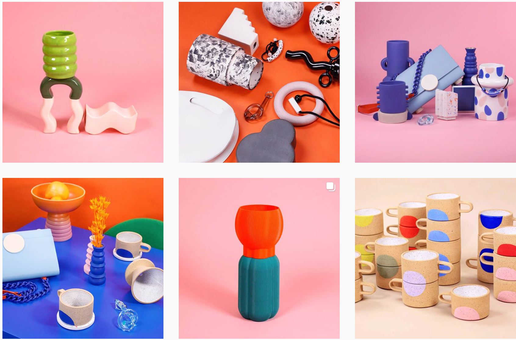
Cool Machine store is an art and design shop that stock various artists. They are brought together by a similar aesthetic. The items pop against clashing backdrops and the composition of the photos are sophisticated and high fashion.
In Summary
* Colour has become more important for brands during covid-19
* Product formats are simplified and colour is more exploited during these times
* Brands are more aware that their customers are holding them accountable for the sustainability credentials of their products, therefore colour is a good way for brands to offer a wide product range whilst keeping their overall company mission and supply chain simple.
* Bright colours tap into our need right now for something to be optimistic about
* We want to escape reality right now and the fantastical use of colour helps us do that.
If you have any other brands you would like to shout out to for their bold use of colour please leave a comment below! we would love to hear from you!